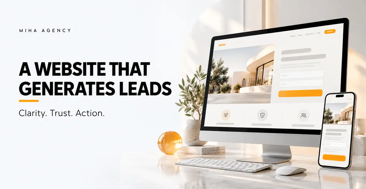
A service website can look polished and still leave visitors unsure about what the business does, whether it is right for them or how to take the next step. Better lead generation begins by resolving those questions in the order a buyer encounters them.
A lead generation website needs a clear offer, credible evidence, an easy enquiry path and a reliable response process. Visual quality supports that journey, but the design should be judged by how well a suitable visitor can understand the service and make a useful request.
Define the lead you actually want
Before changing the homepage or buying more traffic, write a simple definition of a suitable enquiry. Include the buyer profile, service need, project scope and any important geographical or operational limits.
An enquiry from someone outside your service area may look like a conversion in a report while creating no commercial opportunity. A small number of well-matched requests can be more useful than a larger volume of unsuitable submissions.
Specify one primary action for each important page. It might be requesting a consultation, discussing a project or asking for a quotation. The action should fit the service and the visitor’s stage of decision. Miha Agency’s website design services can be briefed around that concrete customer journey.
Make the first screen answer the basic questions
A visitor should be able to identify what you offer, who it is for and what to do next without interpreting an abstract slogan. A useful opening combines a specific headline, a short explanation and a relevant action.
For example, “Better possibilities for tomorrow” leaves a buyer guessing. “Inventory planning support for growing retail businesses” identifies a service and an audience. The right wording depends on the business, but the test is the same: can someone outside the team describe the offer after reading it?
Keep important information in readable text, including when the hero contains video or photography. Check that the mobile version communicates the same proposition rather than showing a cropped visual with no useful context.
Give each service its own decision path
A homepage introduces the business. A service page should help the buyer assess a particular need. Explain the problem addressed, who the service suits, what is included, how the engagement works and which information is needed to begin.
Do not force visitors to scan a long list of unrelated capabilities before finding the answer they came for. Group services logically and connect the overview to focused pages. Where multiple services are involved, explain their relationship in plain language.
Miha Agency’s services overview connects consulting, research, sales growth and specialist execution. For your own site, the same principle is useful: structure the navigation around the buyer’s question and next decision.
Place credible evidence near the claim
If you claim expertise in a service, show relevant evidence where the visitor evaluates it. Depending on what you can substantiate, this may include a project description, a real process example, a named team member, a client-approved testimonial or a sample deliverable.
Explain the context of any outcome. A percentage without a baseline, time period or measurement method gives little information. Do not add invented reviews or unsupported guarantees to make a page feel complete.
Trust also comes from practical clarity: accurate contact details, a realistic process, clear scope and an explanation of what happens after an enquiry. A buyer should not have to submit a form merely to discover whether the service is relevant.
Make the enquiry useful without making it exhausting
Ask for the information the team genuinely needs to respond. A service business may need a name, contact method and a short description of the challenge. A more complex quotation may require additional details, but every required field should have a reason.
- Use visible labels rather than relying only on placeholder text.
- Explain what happens after submission and when a reply can reasonably be expected.
- Show clear validation messages beside the relevant field.
- Confirm a successful submission so visitors do not send the request twice.
- Keep contact alternatives visible when they are supported by your team.
Test the entire flow, not just the appearance of the button. If a page opens a messaging app with a prepared text, distinguish opening the app from actually receiving the message. A click alone does not prove that an enquiry was sent.
Check the mobile experience and performance
Review key pages on a narrow screen with the keyboard open. Check text size, button access, sticky headers, form fields and error messages. Watch for content hidden beneath navigation or sections that overflow horizontally.
Google’s Core Web Vitals guidance assesses loading, responsiveness and visual stability using LCP, INP and CLS. The “good” thresholds are LCP at or below 2.5 seconds, INP at or below 200 milliseconds and CLS at or below 0.1, evaluated at the 75th percentile of visits, with mobile and desktop considered separately.
These are user-experience thresholds, not lead generation guarantees. A fast page with an unclear offer can still perform poorly commercially. Use performance checks alongside real enquiry testing and customer feedback.
Review oversized media, unnecessary scripts and elements that move after loading. Reserve space for images and embedded content. Measure an important template before and after changes so you can assess the effect rather than assuming a new design is automatically faster.
Measure requests, quality and follow-through separately
Track the primary action, but connect it to the sales process. A useful measurement chain distinguishes a submitted request, a qualified lead, a meeting or proposal, and a customer. Agree definitions with the person handling enquiries.
Google Analytics provides recommended events including generate_lead and qualify_lead. The former records a lead being submitted; qualification represents a later assessment. Implementation should reflect what actually happened, rather than firing a lead event on every button click.
For example, keep a messaging-button click as a separate interaction if you cannot confirm message receipt. Avoid recording names, email addresses or message contents in analytics events. Check measurement against real test submissions and account for the consent requirements applicable to your site.
Use a focused website audit checklist
| Area | Question | Evidence to review |
|---|---|---|
| Offer | Can a suitable visitor understand the service quickly? | Opening copy and feedback from people outside the team |
| Journey | Can the visitor find the right service and next step? | Navigation and a complete enquiry walkthrough |
| Trust | Are important claims supported? | Relevant examples, process details and verified proof |
| Mobile | Can the visitor read, interact and submit comfortably? | Real-device checks, keyboard behaviour and field errors |
| Measurement | Do reports distinguish interest from received enquiries? | Event validation and sales records |
| Response | Does a clear owner follow up? | Request routing, response process and next-step records |
Improve the weakest part of the journey first
If suitable visitors arrive but misunderstand the service, improve the proposition and service information. If they begin an enquiry but cannot finish, inspect the form and technical flow. If requests arrive but receive inconsistent follow-up, fix ownership before increasing traffic.
Useful articles can support the journey by answering questions that arise before an enquiry. Miha Agency’s content and SEO workflow outlines how to connect intent, structure and helpful answers. Content should give readers a meaningful next step into the relevant service.
Frequently asked questions
Do I need a complete redesign to get more leads?
Not always. A clearer offer, improved service page, working enquiry flow or better follow-up may address the main issue. Diagnose the journey before defining the scope.
Is conversion rate enough to judge success?
No. Define the conversion and review lead quality, sales progression and the cost of generating suitable opportunities. A higher submission rate can still produce less useful business.
Should every page use the same call to action?
The primary action should reflect the page’s purpose. A consistent enquiry route helps, but the wording and context should fit the service and the visitor’s decision.
Plan the website around a commercial outcome
Bring your current website, target customer profile, main service and available enquiry data to the discussion. Book a free website consultation with Miha Agency to identify the part of the customer journey that most needs improvement.